March 7, 2024

By Jakob Örneberg
A guide in Microsoft Dynamics Sales to visualizing the average closing time for won opportunities.
If you have a modern CRM, you likely work with Opportunities. In that case, you almost certainly use a Business Process Flow that guides you from creating the opportunity to the final stage of closing it.
An interesting Key Performance Indicator (KPI) for every organization is knowing the average time it takes to close an opportunity – or, as this blog post focuses on, to complete the Business Process Flow.
This metric is important for several reasons:
- Forecasting and planning: Understanding the average closure time enables your organization to forecast sales more accurately and plan resources more effectively.
- Performance measurement and improvement: How should your organization improve the sales process if you don’t know how long the sales process is?
- Customer relationship management: Understanding the sales cycle duration helps managing customer expectations.
With this in mind, you’re probably wondering: How can I determine my average closing time?
There are several methods to visualize this data, I will introduce you to one approach that can be considered straightforward.
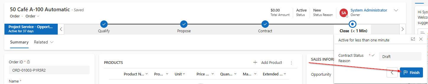
Step 1: Create a view at you Business Process Flow Table.
Your view could be configured as follows:
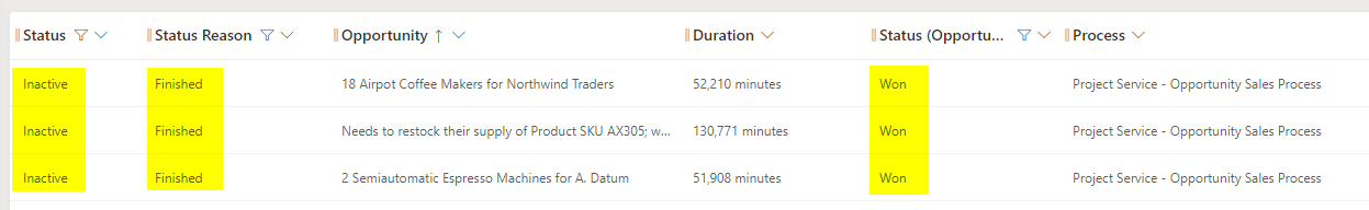
- The status of the Business Process Flow should be Inactive and the Status reason should be Finished.
- For my analysis, I’m interested in the related Opportunities table, focusing on opportunities that were successfully won. Therefore, filter Status on Won.
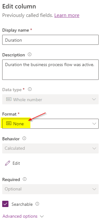
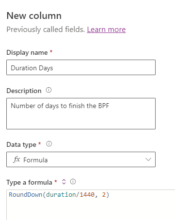
Step 2: Convert minutes (minutes, why!?) into a more understandable format.
First, adjust the format in Duration to “None”.
Since there are 1440 minutes every day, I create a new column Duration days and calculate how many days the minutes are equal to. “2” is number of decimals.
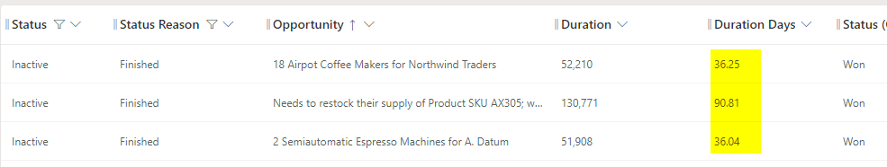
Now, just add Duration Days to your view.
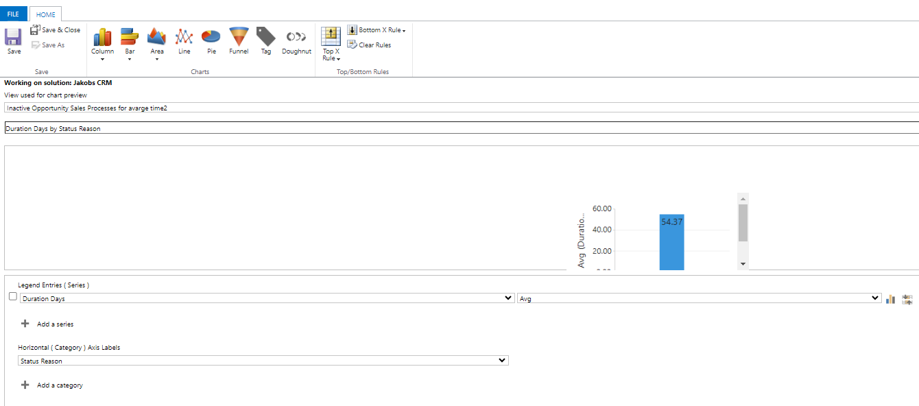
Step 3: Create a chart and put it on Dashboard.
Lastly, create a chart and publish it on the dashboard.
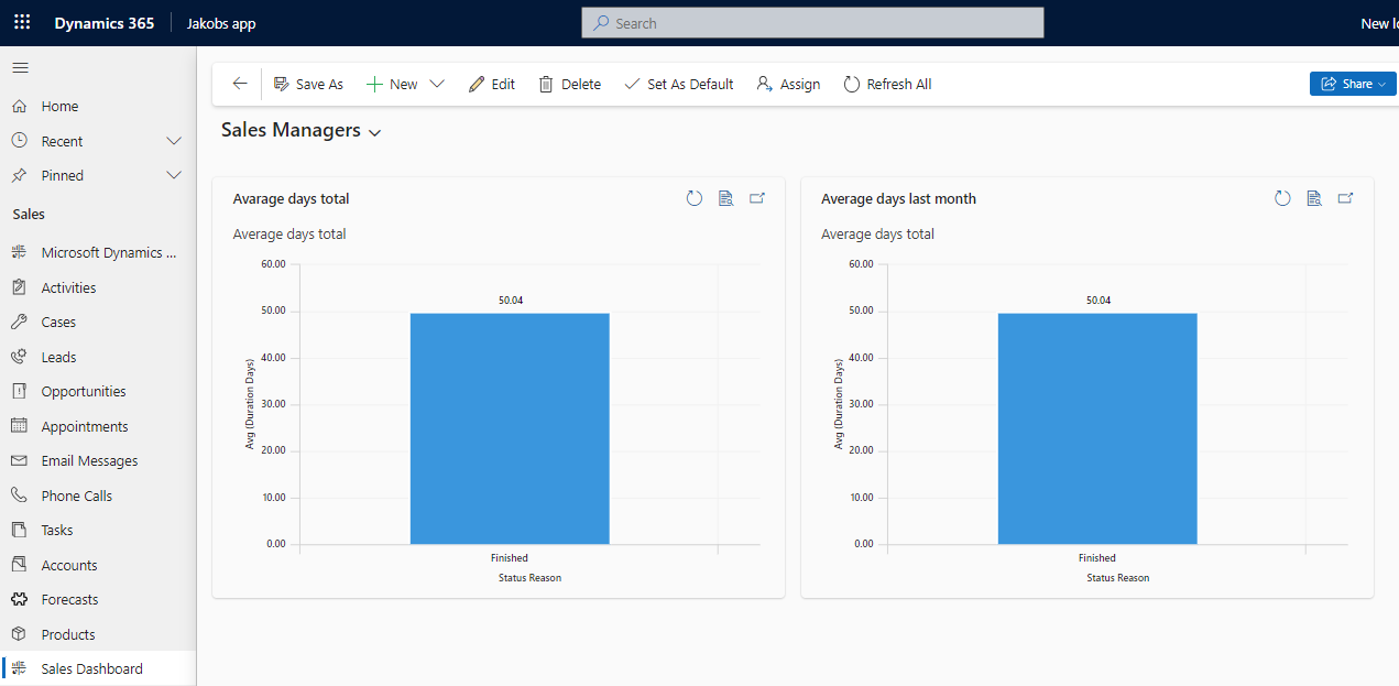
Tip: I did one chart with “Average closing days last month”. With this chart it is possible to benchmark and try to improve the sales process and customer journey.
Best of luck!